
Case Study:
El Dorado Protocol
A deep-dive case study into the innovative cross-chain decentralized exchange.

Services
Brand Design
Brand Strategy
Illustration
Merchandising
Motion
Designers
Abraham Weiskorn
Jose Villacrez

El Dorado is a dex, markets aggregator and full personal financial suite developed with user sovereignty and democratized access in mind. With a portal that offers unmatched access to glimmering possibilities they needed an identity to match.
El Dorado provides traders and investors unrestricted access to exchange markets, cryptocurrency storage solutions, and attractive yield earning products.
Their tech stack combines speedy order execution and convenience into an integrated widely accessible platform. Their service offerings leverage features commonly found only on centralized exchanges, all without compromising on their promise of sovereignty, decentralization and security. They collect no KYC from users, and hand control to the user over their assets.
The resulting proposition is a platform that has the best of both worlds, containing some of the bells and whistles of a CEX, while maintaining the sovereignty and security of a DEX. All while Being independent, unashamedly gritty yet curious and bold.

Brand Audit
Exchanges and Aggregators are the liquidity hubs of growing and thriving value-exchange economies, they are absolutely essential for crypto but the space is plagued by clunky and inefficient platforms, downright clones, bad UX and siloed ecosystems. Targeting crypto-natives and newcomers alike, El Dorado has to feel seamless for the time-strapped veterans that want unhindered access to new ecosystems and asset listings all while also addressing the needs of new market participants that wish to learn about the space and gain exposure to more risk-averse passive earning opportunities. Fittingly, the El Dorado team identified their brand attributes as Adventurous, Sovereign, Immersive, Pioneering and Personable. From that point, we landed on the most important message (MIM): Glimmering and Unexplored. The new El Dorado brand needed to capture the feeling you get when you’ve arrived at an unexplored place early, before the masses, where treasure and opportunities abound and there’s plenty to explore. In other words, the very essence of exploration and treasure hunting.
From that brand standpoint, El Dorado’s competitors dwelled in neon blues, aquamarine and green-blue gradients and overly used sans-serif typefaces. You could look into all their competitors and quickly note struggling to tell them apart and remember which is which; this meant a thrilling opportunity for El Dorado.

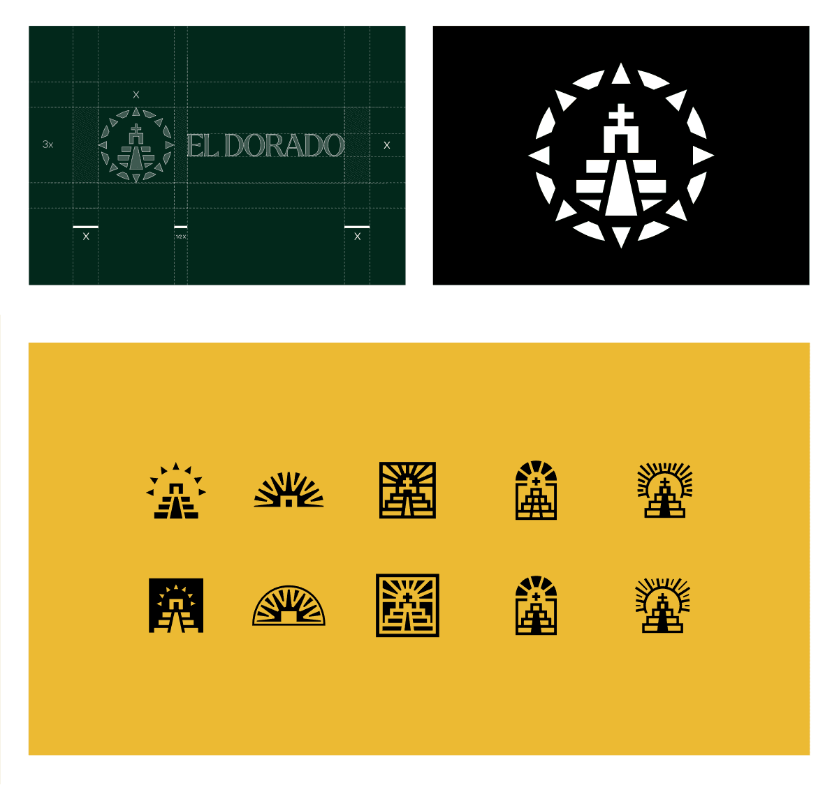
Logo
Playing into the moniker of El Dorado, the logomark showcases the riches behind the brand and how it facilitates access to them. We explored a mark that centers around an abstract iteration of the iconic temple mentioned in the story of the mythical city. We delved into various forms for it but settled on a version featuring wide ascending steps that lead into a main prominent door arch. We then sought to wrap the temple inside the sun and segment it as such that its rays could double as a compass bearing a point to all the cardinal directions and atop it all as an accent, a cross. These explorations focused primarily on the physical elements found in the story of El Dorado, along with a compass to find it.
We dubbed the final mark Sun Temple. The intent was to create a mark that felt fun and gave you the feeling of wanting to go and explore new opportunities. All while being modern and differentiated from the competitive landscape.
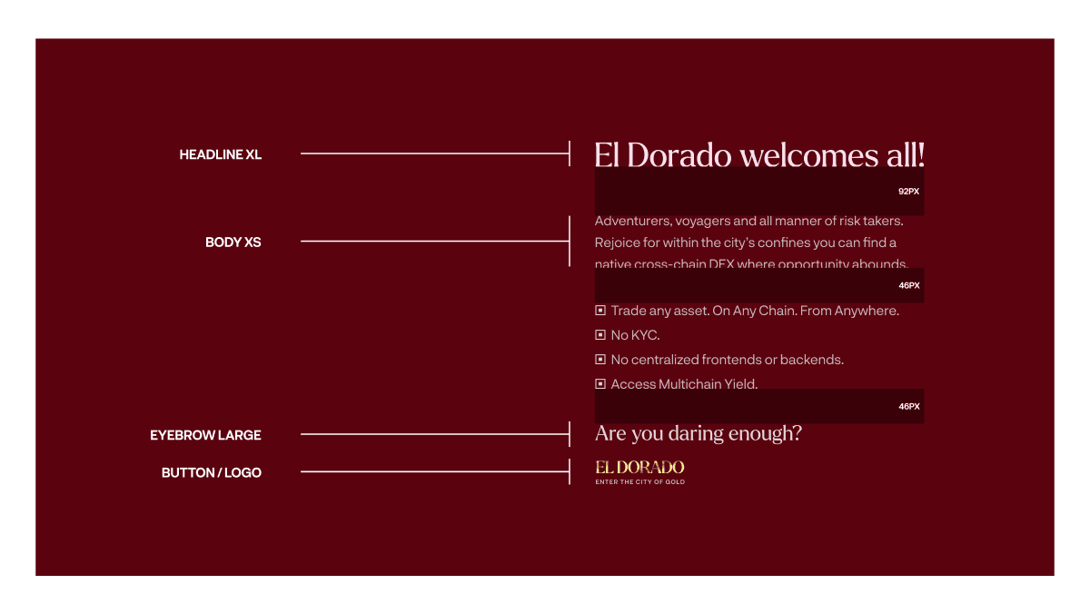
The logotype is a customized version of Larken. A naturally-soft yet wildly expressive font that provides interesting letterforms that pair well with natural themes and which, when paired with a heavy weight, leads to a logo that feels bold, engaging and chuck-full of adventure.
Visual Language
The color palette features a custom triad scheme with bold main colors and neutral transition colors, together they combine to portray colors readily available in an amazon jungle clearing with a dash of a modern 21st century twist, they put El Dorado right there in that setting and in that action. They align with El Dorado’s brand personality archetype; Explorer-Rebel.
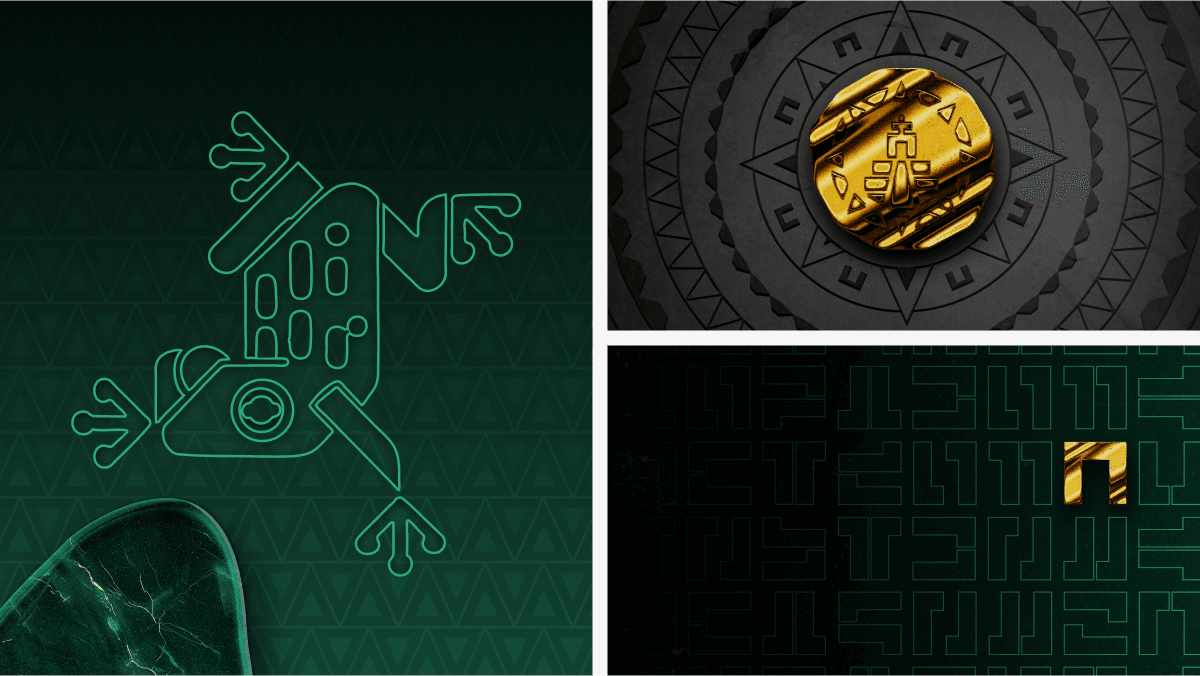
El Dorado’s graphical elements composed of their golden doubloons, rock tiles, gemstone fragments and compound patterns form part of a flexible visual language. They provide structure, help deliver the brand lore and highlight some of the rich history behind the El Dorado myth all while adding mystery to the brand experience. Delivering an open letter to adventure for users of the platform to tap into and partake in.
We also used the temple door arch which doubles as a secondary logomark to create a pattern that resembles an ancient language and can be used in various settings. It doubles as a signature element of the visual identity and can be used as a grid to place and showcase the brand’s graphical elements.
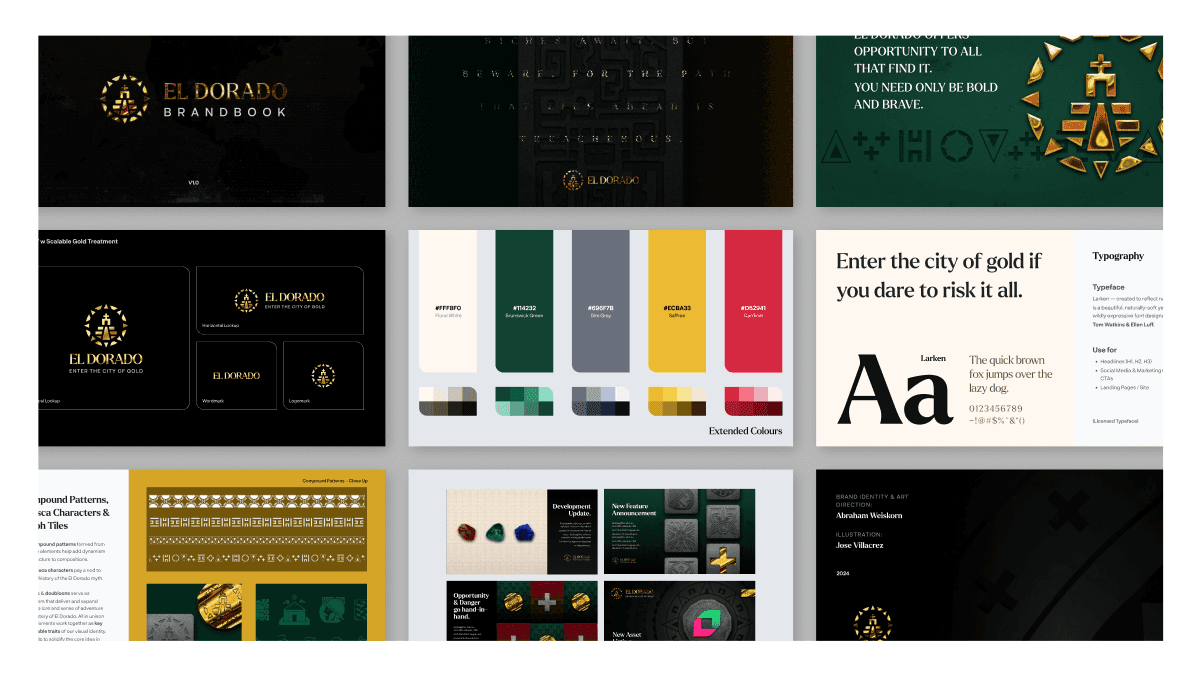
Brand Support
A brand’s job is never quite finished! After going through and adding the final touches to their new brand, El Dorado asked us to help apply it to their touchpoints. The new language, colours, graphical elements and communication interactions. Bringing everything in line with the call to adventure.
Conclusion
The new El Dorado brand needed to capture the essence of exploration and wanderlust to hidden places, the pursuit of opportunity and the prospect of being able to tap into exotic riches early on, all while also highlighting potential risks. We believe we’ve accomplished just that.
At Delphi Design, we don't just create design solutions; we take point on strategy, develop stories that connect with audiences and flesh out relatable and engaging brand lore. For El Dorado, we leaned heavily on story and used design thinking to highlight and reinforce the things that mattered. The result? A brand identity that in our humble opinion truly glimmers, takes us to dangerous new frontiers rife with opportunity but most importantly, favours the gold.
Are you curious, brave and daring enough to enter the City of Gold?
Building something special?
Whether you're a visionary founder, a motivated team or an established brand looking to take the next step, we'd love to hear from you and discuss how we can be part of your journey to shape the future.


